Great digital products have a few perceivable qualitative characteristics in common. They are desirable, usable, useful, reliable and efficient. It’s a challenge to keep all these pieces well balanced.
I’ll share how we can improve the overall user experience by using micro-interactions and other basic principles of motion design.
Designing the details
Interacting with digital products in our daily routine is very common now. They help us pay our bills, find transportation, communicate. There is a flow behind each of those products that should lead us to complete a particular task.
The contact between the products and us are the moments of interaction. And during these moments, there are other simple interactions that we usually don’t notice. But they are there and are crucial. They are called Micro-interactions.
“Micro-interactions are moments of interaction between you — as a user — and a small task-oriented component. A micro interaction has one main task.”
— Hugo Noorlander; Maxime Tania.
Smart Thinking: Microinteractions Animation
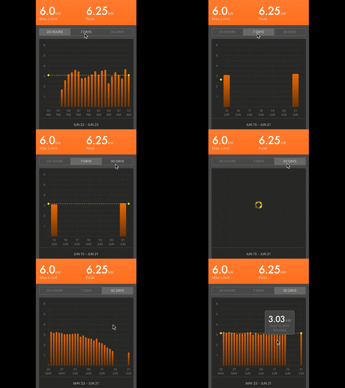
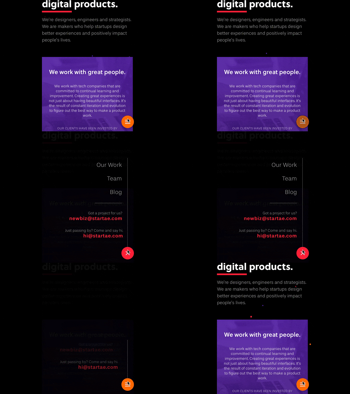
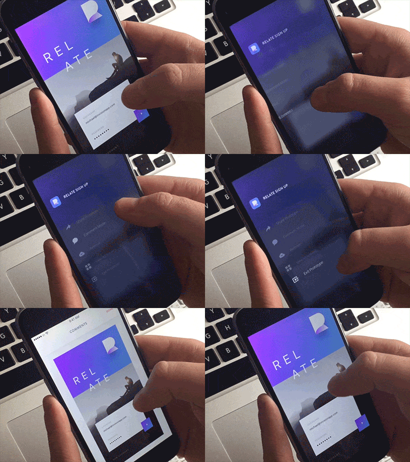
It isn’t about how cool your interface looks, or how it functions under the hood; it is about the entire experience. Animations are a good way to explain what’s coming next. There are two basic concepts of motion design that improve the micro-interactions to make an user experience better. First, the animation shouldn’t take long to load. Second, any interaction with the user should cause a visual response, such as communicating feedback or showing the result of an action.
Besides, they help the user’s focus on a single task, enhance the sense of direct manipulation, and they add value to the digital product’s branding. For example, when you click on the “Like” button, you will notice a subtle animation and sound to provide feedback. It is a popular microinteraction inside Facebook’s, and it is a characteristic (or feature) that belongs to their branding as well.
A delightful experience that is focused on the user makes your product go from pleasant to unforgettable.
“The difference between a product you love and a product you tolerate is often the microinteractions you have with it.” — Dan Saffer
How we do it
At Startaê, we are passionate about designing great experiences and we are always improving our design process, and solutions that we think will help to create great experiences.
We have five steps in our workflow. Discovery, Make, Test, Ship and Repeat. When we are making and testing solutions, we use a few solutions to prototype the user experience, the user interface, and the micro-interactions. After that, we create a storyboard, usually on paper and then implement and test it.
The tools that we use may vary depending on the need. We usually use Marvel and InVision for simple prototypes. For advanced animations and interactions we use Framer, Principle, After Effects and HTML/CSS/JS, in order to create the best prototype for the project.


The takeaway here is that motion design and micro-interactions are essential for delivering great experiences that break people’s expectations in a good way, and make people love the product they have in their hands.


