
We have changed our logo recently and we already showed why we decided to do that. This post will talk about how we created, the successes and the pitfalls we had and everything we learned during the rebranding process.
At the beginning, we tried two different paths. The first was to try and keep the same style of the old logo and the other was to try to design something entirely new inspired on geometric letterings. On both cases, we wanted to change without losing our core identity, but we soon realized that we needed to go deeper to move forward.
We noticed we needed to take a deep dive into what we wanted to represent with this new brand.
We noticed we needed to take a deep dive into what we wanted to represent with this new brand. We started by organizing our ideas on a board following a project methodology designed by Austin Shaw.
We picked the word start as, ironically, a starting point. Then each member of the team designing the logo had to work individually on five steps. First, we had to write nonstop for 5 minutes about everything that word reminded us of. Next, we had to highlight most important words in the text and list them separately.
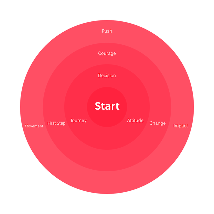
On the second part, we built a mind map where we would link these words and find connected meanings. Based on this overview, we wrote a “Do’s & Don'ts List” and a short description of what would be the brand concept. We also collected icons based on the selected concepts.
During this exercise, all perspectives were considered. From people who have been here the least amount of time to people who have been here since the beginning.
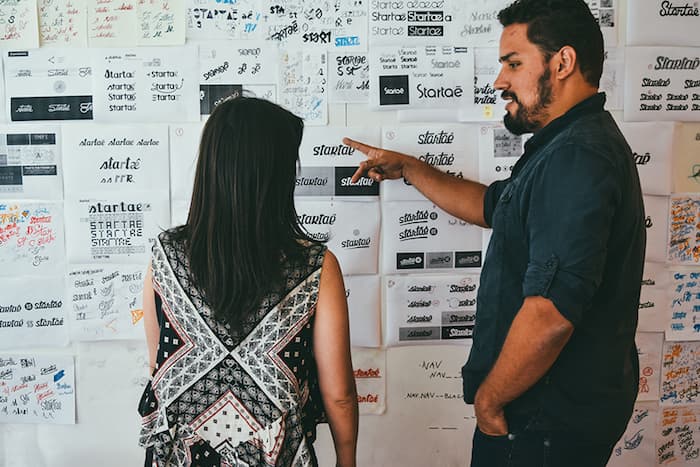
Once it was done, this board with the brainstorming of ideas was shared with everyone on the team. We had daily meetings to discuss the results, identify patterns, add/delete reference images and choose a path to follow.
“We want to develop a logo that adds personality to our current logo and facilitates the reading/pronunciation for people from around the world. I think we can make clearer that the company name is also a call to action: ‘Got an idea? Startaê.’”
“After a few years, we realized that only to start was not enough. A lot of people start a lot of things and give up after a while. Today we try to work with people who are engaged not only in starting but people who are engaged in continuing this journey. We know there will be a lot of mistakes and learnings along the way, but the most important thing is to keep evolving. People usually start the path by thinking where they want to get at the end. We realized along the way that what matters is the journey. I think Startaê is an invitation to begin and enjoy every step of this journey looking at each failure as a learning opportunity.”
I think Startaê is an invitation to begin and enjoy every step of this journey looking at each failure as a learning opportunity.
“Perhaps this moment of the brand change can be a representation of the company’s maturity. We realized we cannot just start; we must keep on growing.”
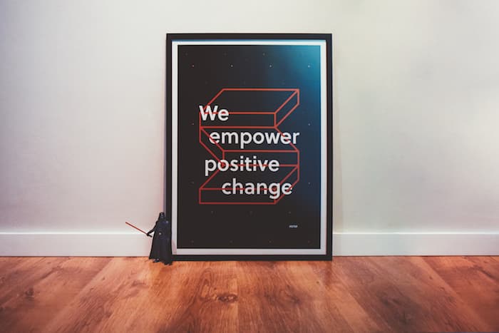
“We want to develop a logo that is straightforward and gestural. We want to emphasize the importance of the hands-on and doing things yourself. We want to demonstrate the initial impulse of the start can lead to a series of actions and result in positive changes in the future.”
Those were part of the brand concepts our team wrote in that exercise. Whenever in doubt, we kept coming back to them.
We continued working on more alternatives. We sketched our ideas on paper, tested them on Illustrator and printed them again. Each day, we worked a little bit more on the alternatives, made some adjustments, modified the weight, corners, and positions. As part of the process, we also had daily feedback meetings with the founders and other team members.
We were a month and a half in and we felt we were close to the personality we wanted for our logo, but something was still feeling wrong. Something was still missing. That was when we decided to take a break from the lettering and started designing the symbol.
The symbol had to be something that could represent Startaê in a way that typography can’t. Based on the icons and concepts selected before, we started to sketch different things we thought could complement the brand.
We wanted to materialize the entrepreneurship idea. We picked words that represented entrepreneur’s characteristics and searched for icons and photographs that already had a relationship to them. With that, we designed options from characters concepts to abstract shapes. After a lot of refinement, we got to a stair as a symbol of the entrepreneur’s path. It simply and beautifully represented everything we wanted and still resembled an S. The only problem was the symbol and the lettering option that we had didn’t match.
One of the lessons we learned on this project was not to design separately two elements that are supposed to work together. Because it is very likely that, when you put them together, they are going to be so different, you’ll have to choose between them.
For us, that mistake turned into a way to discover new paths. We decided to adapt the lettering to match the symbol. We headed back to our geometric designs and thought about how to combine its characteristics with the alternative that we had in hand.
It was a lot of work but also really rewarding for our team to be able to uncover our values and reflect them on our brand.
It has been almost two months since we launched our new logo and we couldn’t be happier with the results and feedback. We hope our learnings inspire someone out there who is also going through a rebranding process. One step at a time, keep moving forward!