
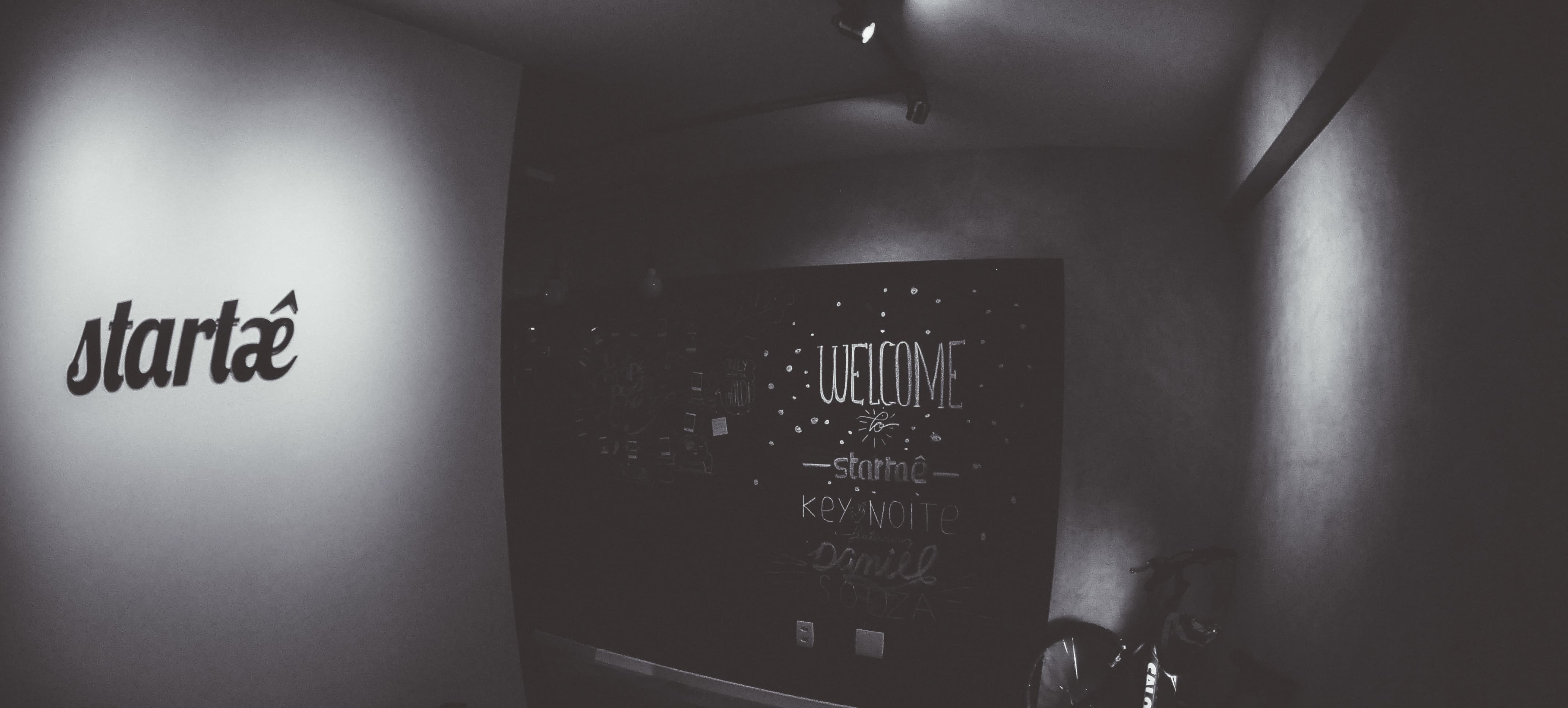
On April 10th, Startaê celebrated its 4th anniversary. That means a lot to us. We are proud of how far we have come and excited with everything coming this year. During these four years, Startaê has changed, grown and established its culture, but the logo has remained the same. We want to be recognized for the things we do that have a positive impact, but we also want to be remembered for the things we believe in.
The logo is one of the main representations of a company. It connects people’s minds to the business. That is why we believe our logo has to speak for us. It has to represent who we are and the things we believe in. Our old logo was not doing that anymore; it had to evolve as we did.
We took a deep dive into our beliefs and values and came up with not only a new logo but a whole new brand system. After four months, we have everything in place, and we are very proud of the results.
Let’s go back to the beginning
We started our business at a local coffee shop where the only things we needed were wi-fi and a few laptops. Our goal at the time was to take the first step, see if people would be interested in the service we were selling and the way we were selling it. That’s why we started small and focused on making our idea happen. Having a fancy office or a perfect logo were not priorities at that time.
Our first logo was a good enough solution we needed at that moment. It did a great job of representing Startaê throughout the past years, but as we evolved, it made sense to invest time to create something that represents who we are now.
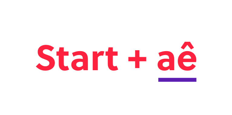
We also noticed that some people still had problems to pronounce our name. The name comes from a combination of the English word Start and the expression “Aê”, which is a Brazilian expression that adds energy and determination to what is being said. You can pronounce it start-ah-eh. Once people understood this construction, they had no trouble understanding the name. The problem was that we were not always around to explain that.
After all that considered, we decided that it was time to change. This new identity would have to represent the company’s maturity. We wanted to create a logo that would match our personality and facilitate the reading and pronunciation for people around the world.
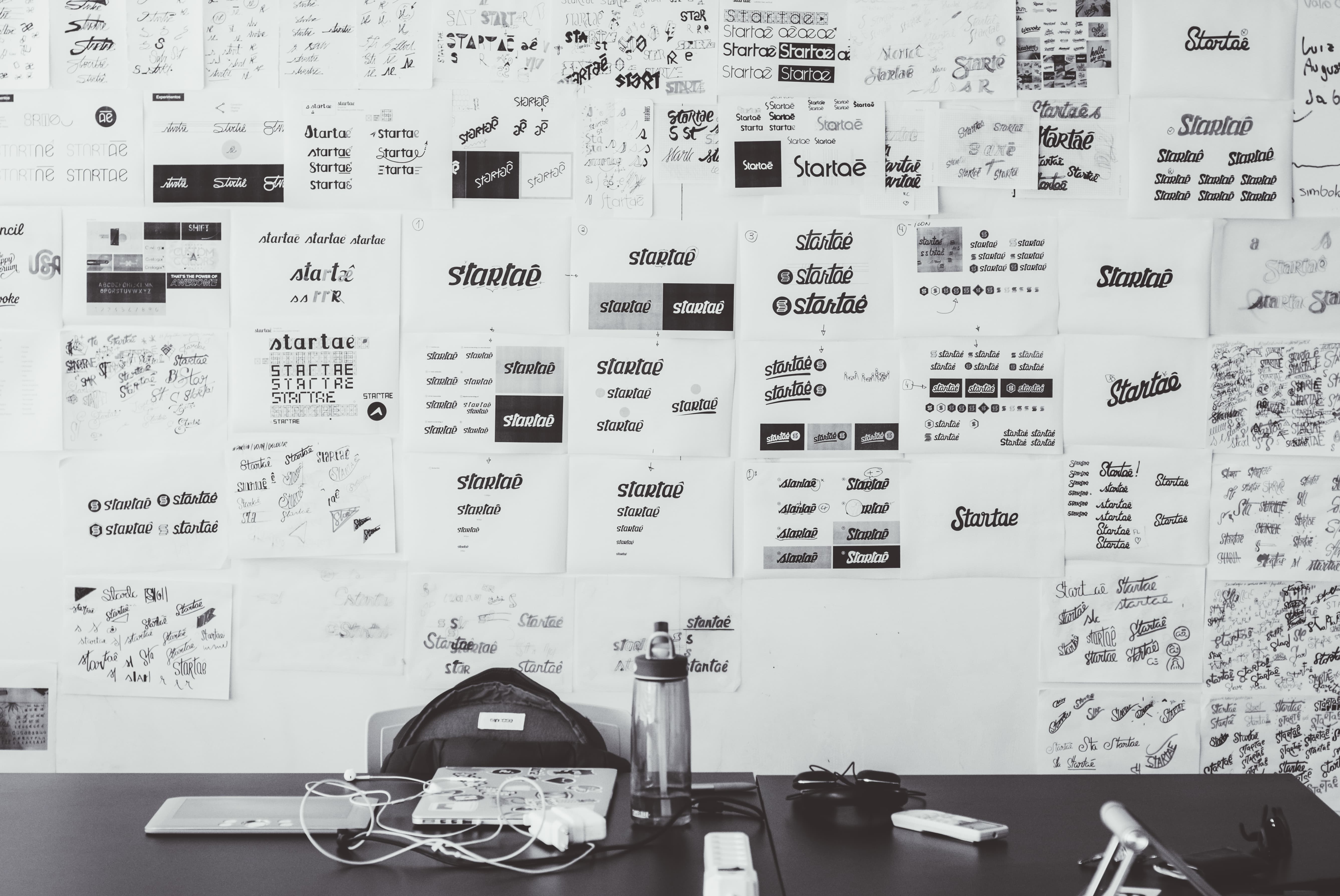
We worked really hard on how we could represent all these ideas in one logo but we’ll talk more about this process and how we rebranded on another blog post.
Meet the new branding
This project was a big opportunity for us to learn by doing. We accepted the challenge to create a new identity and to uncover the values behind our brand.
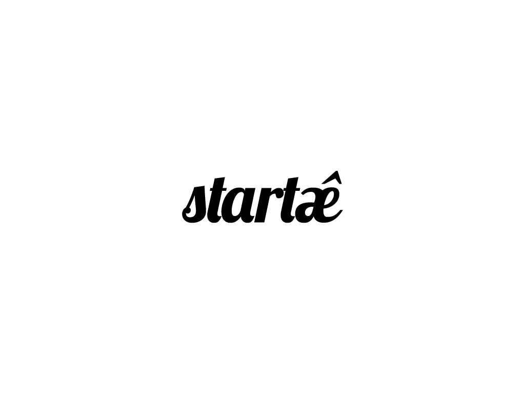
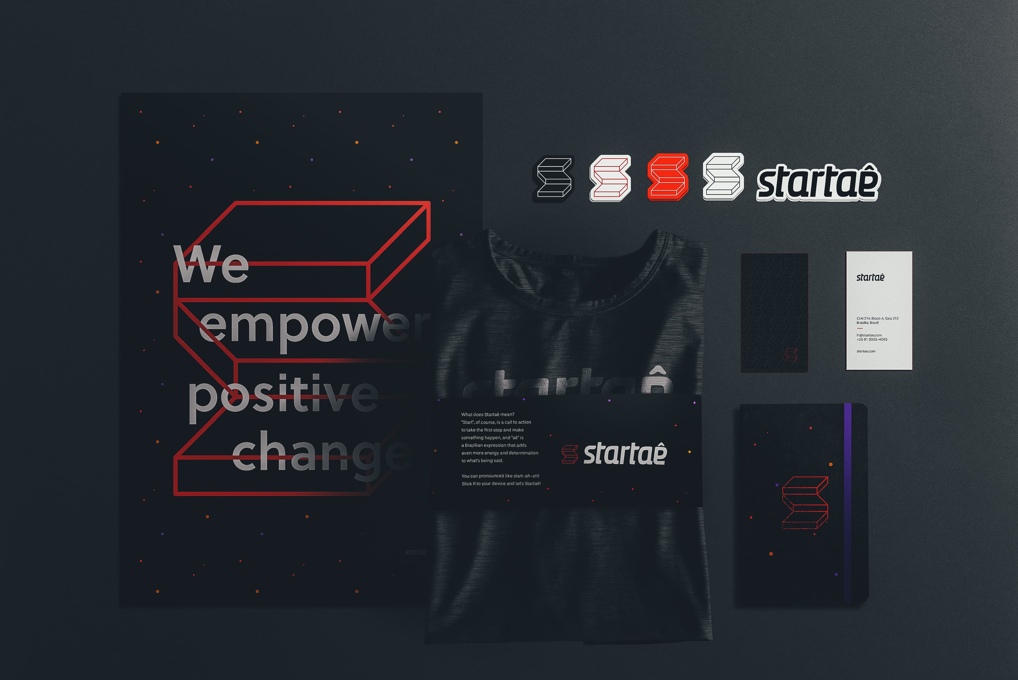
Logotype
The lettering is clean, easy to read and not trendy. It is slightly slanted suggesting movement and action. And it is still somewhat similar to the old logo but now the “a” and “e” are separated, which make them easier to read.
Symbol
The symbol is a metaphor for the entrepreneur’s journey. It represents the steps and decisions the entrepreneur has to take along this non-linear journey.
After a few years, we realized that only to start was not enough. A lot of people start a lot of things and give up after a while. Today we try to work with people who are engaged not only in starting but people who are engaged in continuing this journey.
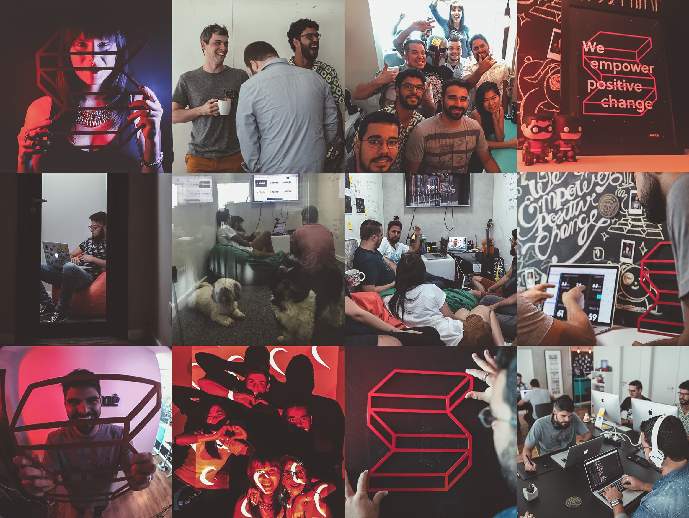
People usually start the path by thinking where they want to be at the end. We realized along the way that what matters is the journey. We think Startaê is an invitation to begin, to take the first step and enjoy the journey, looking at each failure as a learning opportunity. And our symbol represents that.
We think Startaê is an invitation to begin, to take the first step and enjoy the journey, looking at each failure as a learning opportunity.
Colors
We preserved the main color as black & white and chose other three colors to be part of our identity. A vivid red, orange, and purple help to maintain our identity on throughout our touch points and are combined on all of the logo applications.
For the rest of our visual identity, we developed simple but strong applications. The main one is a pattern that resembles stars, galaxies, and spaceships. Like stars, there are billions of opportunities out there. A million services and startups are born every day, and we are here to help them run and grow their businesses. If someone is working on something that can positively impact people’s lives, we want to be there to help make it happen.
On this journey, we also dedicated time to materialize our core values. We took the time to look inside and see how things happened here. What is Startaê’s personality like? What are the factors considered when making a decision? What can not be left out of everything we do?
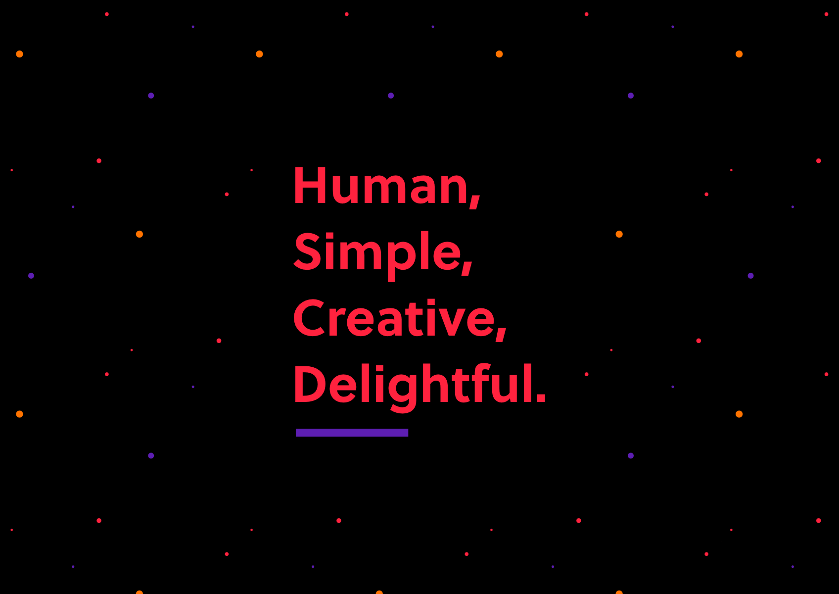
We were able to synthesize these values into four lenses: Human, Simple, Creative, and Delightful. Since then, we use them to design and review everything we do. They are our guidelines. It is almost a checklist of how we believe things should be done to achieve positive change.
What now?
“There’s nothing permanent except change." — Heraclitus
We believe in empowering positive change. We do that by helping startups from all over the world with design and technology, by creating products to change markets that need new solutions and by sharing knowledge that can help and encourage people to take the first steps and not give up on their journeys. That applies to our team as well. This is the kind of mindset that upgrades the Startaê team to another level each day. This project was another step on our journey. Now that is established we must focus on finding the next one.
We believe great ideas improve lives and make our world more human, simple, creative and happier. We created Startaê to help entrepreneurs and companies make the difference. If you are working on something great, we would love to help make it happen. Let’s get started?