How we helped a tourism company to launch their first startup
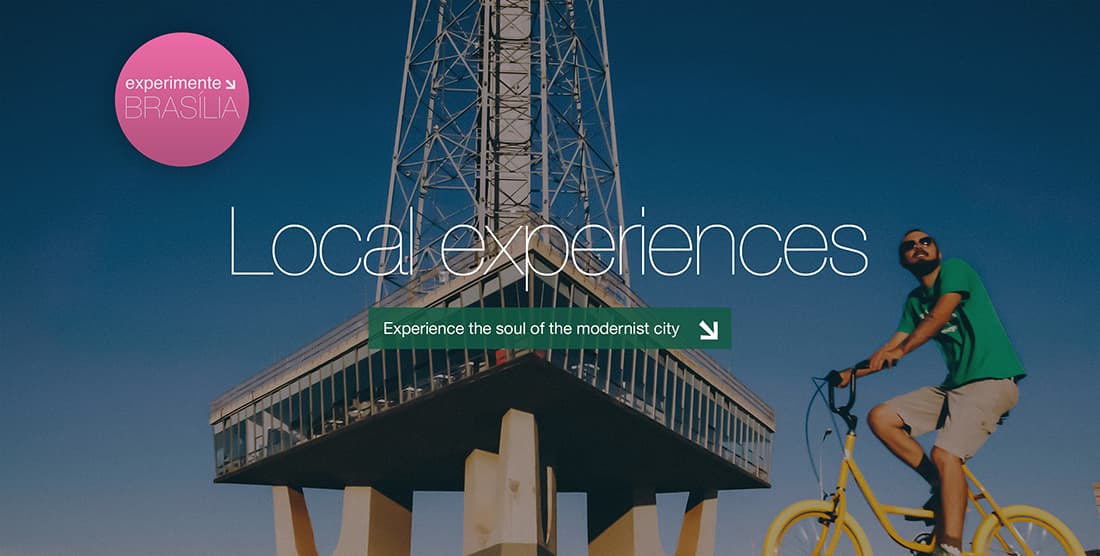
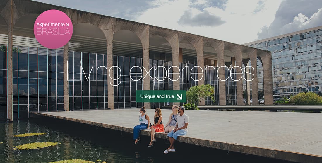
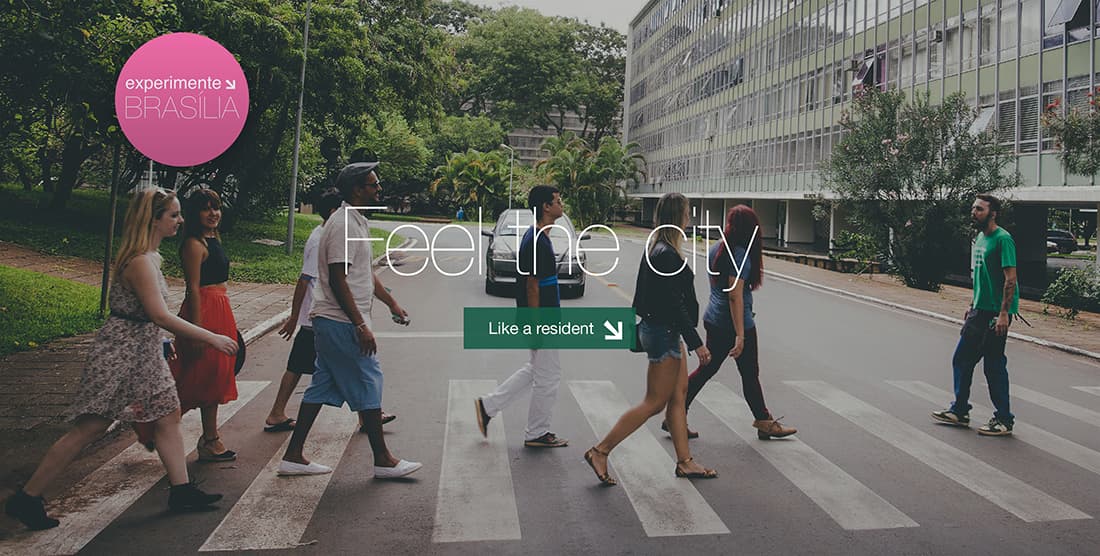
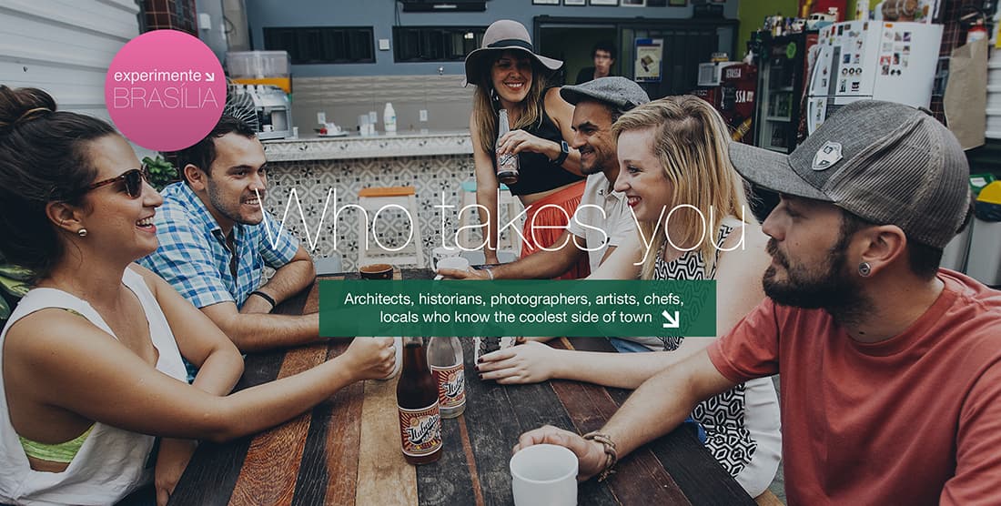
Experimente Brasilia is a platform that connects creators of authentic and creative tour experiences with people who want to get to know Brasília from a different perspective.
A showcase of unique experiences
Triade is a Brazilian company that designs experiences that connect people to the city's patrimony, tourism and education. At some point, they saw a market opportunity and had an idea called Experimente Brasilia. They wanted people to visit and experience the city of Brasilia in a way even local people don't usually do. What's more, they wanted to create a platform that would connect visitors with the people who truly know the cool side of the city. That's when we came aboard.

We worked together to understand their business model, what they wanted to transmit to their clients and what their biggest challenges were. We understood that they needed a platform that would enable them to showcase and sell unique experiences in Brasilia. After our first day, the first mockups were created. We defined how the experiences would be showcased and how the clients would be able to book their experiences.
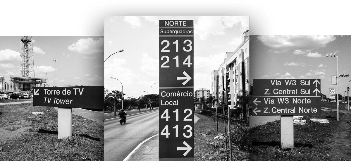
Identity of street signs and modernism
Before designing the UI of the platform, we had to define the product's identity. The identity needed to be versatile enough to go well with any experience and reflect the concept of creative tourism and Brasilia's identity.


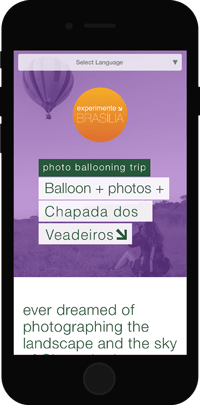
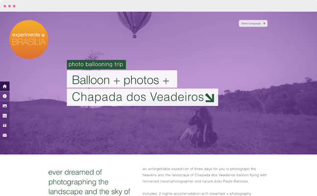
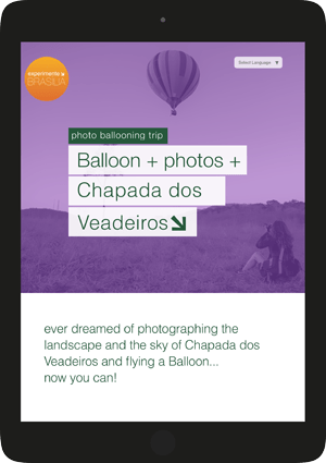
On the homepage, we designed a square grid where the experiences' covers and names would be showcased. They would be displayed in such a way that each time an user entered the website, they would have changed positions and the user would have a different experience. We also built an administrative area in which an admin user could add new experiences and customize the layout.
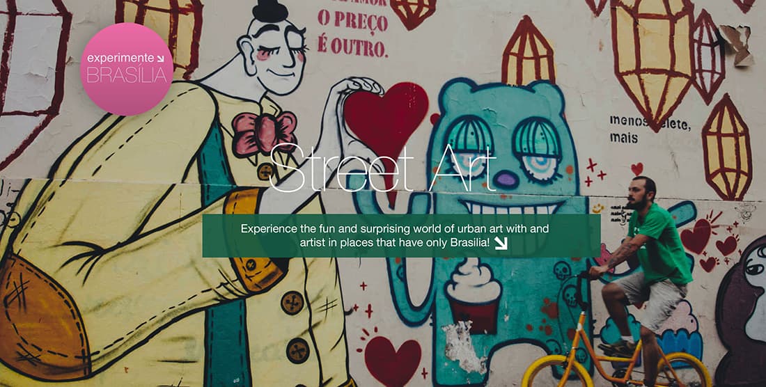
When designing the homepage and the experience pages, we wanted them to work in a way that would allow the website to expand smoothly when new experiences were added, but also allow each one of them to have its own identity. To find that sweet spot between customization and automation, we allowed each experience to have its cover photo and specified color palette.

Spreading the story
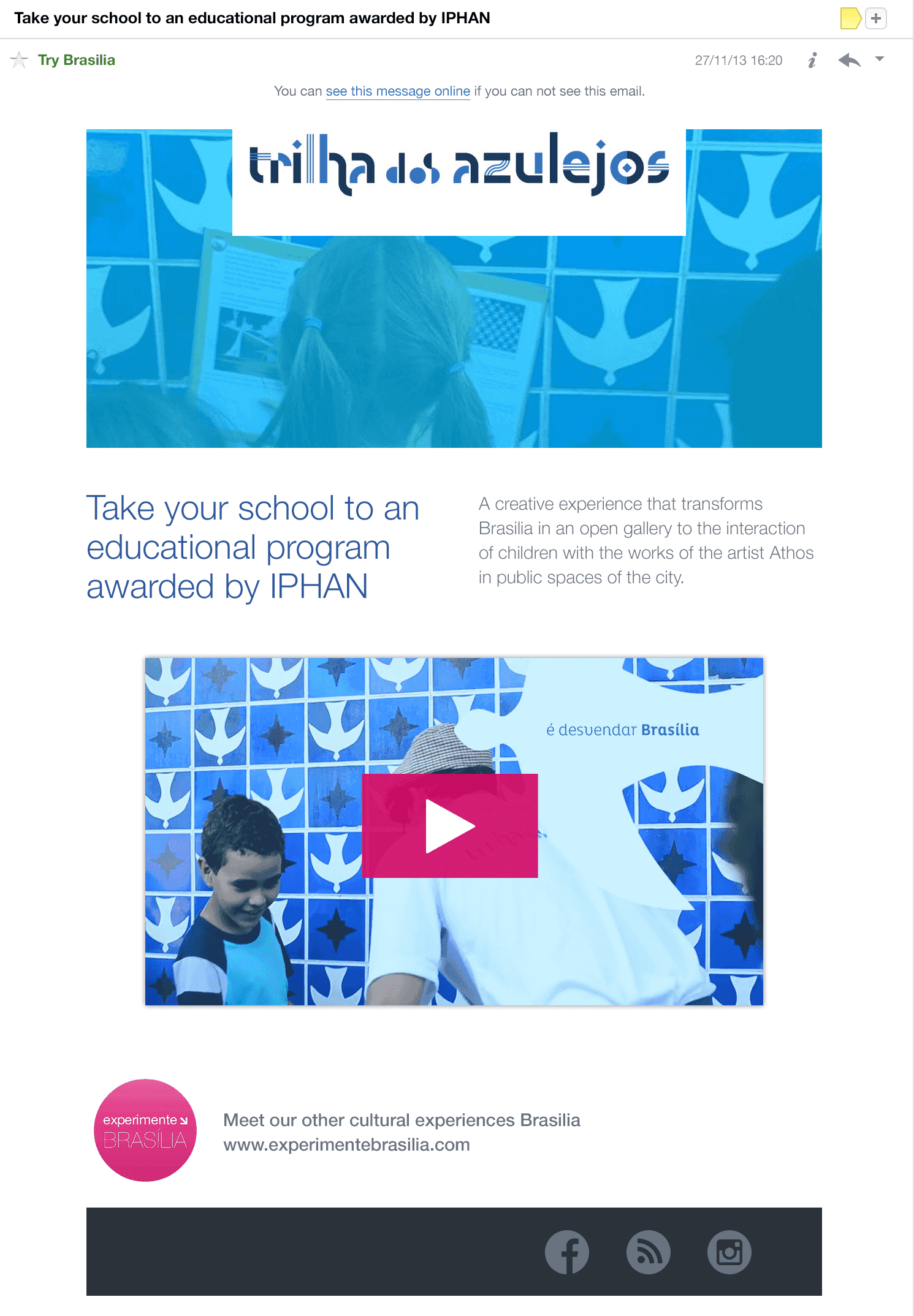
After the launch of the site, we helped Experimente Brasilia with the creation and management of their branding. We created several design elements that helped them to have a strong branding — elements such as design for their social media profiles, email signatures, newsletter design and implementation.
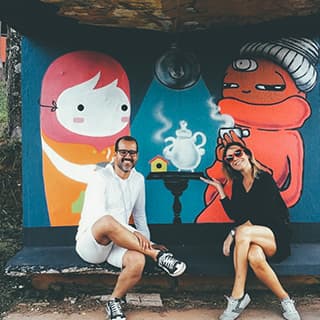
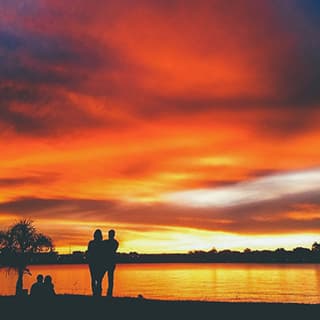
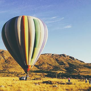
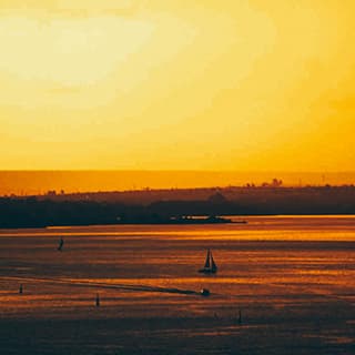
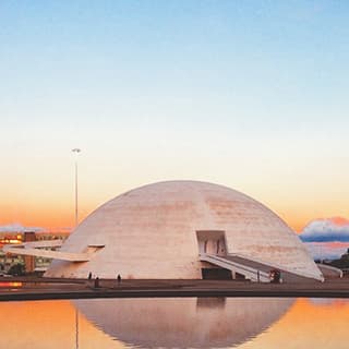
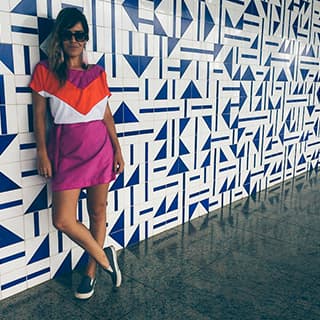
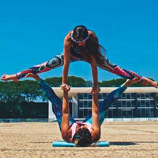
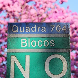
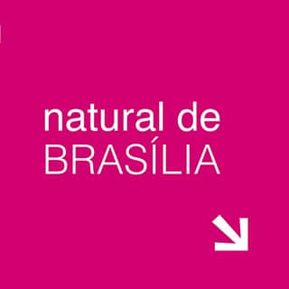
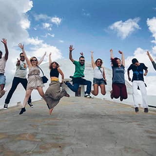
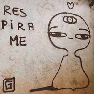
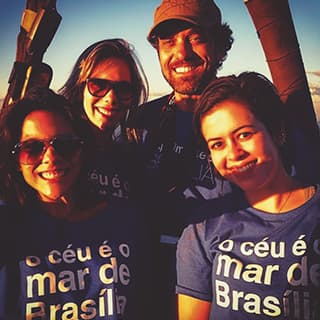
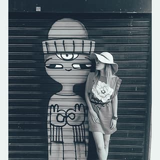
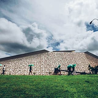
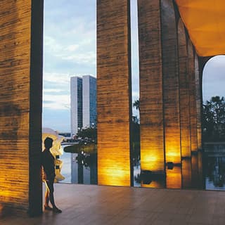
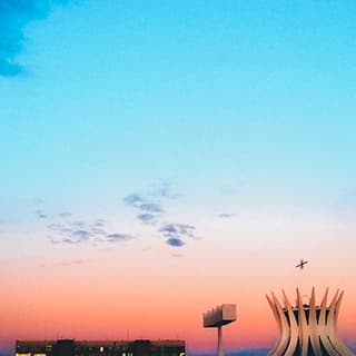
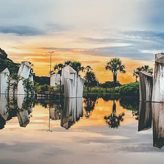
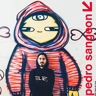
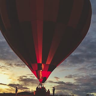
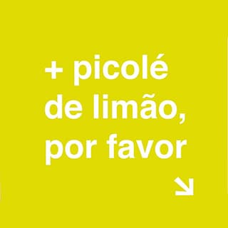
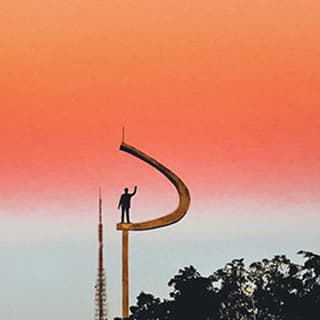
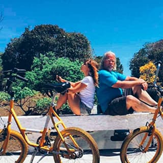

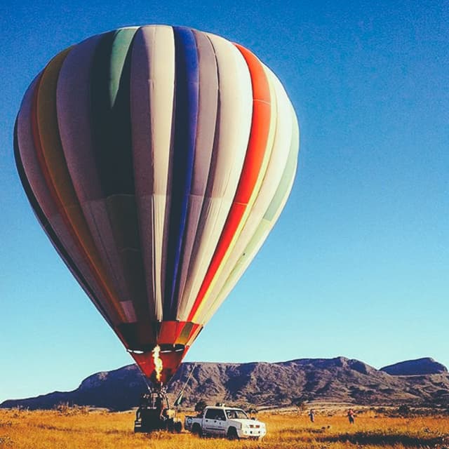
From a simple but well-designed avatar for their social media profiles to a customizable newsletter design.

How can we continue growing?
We launched Experimente Brasilia as a MVP. We strongly believe in gaining insights from your real customers, learning from them and then deciding what the next steps are. When it was time to make the evolutions, they had learned with the platform. The number of reservations had grown a lot, and they felt the necessity to automate the payment and schedule processes so that they could continue growing.

Payment tool
We implemented IUGU, an online payment tool that also manage subscriptions, calculates commissioning and tracks growth metrics. Now the user could buy and schedule their tour directly from the tour's page in an easy and intuitive experience.
As a part of those evolutions, we wanted the website to be available in several languages so that it would be understandable to non-Brazilian tourists. To do that in a fast but effective way, we integrated the platform with Google Translate so the user could choose in which language he wants to see the website. Lastly, we also worked on optimization and performance of the platform and the responsive version.
Brasilia's pride
We're proud to have helped Experimente Brasilia become reality! From the idealization to the design, implementation, launching and the final result. We felt especially connected to the project's purpose. It shows that Brasilia is so much more than a city of politicians, it is a city full of art, creativity and people making things happen.
In the news
Since day one, Experimente Brasilia has gained a lot of visibility in the media, and it has been growing constantly. It's now a top-of-mind reference when thinking about creative tourism in Brasilia for tourists and residents of Brasilia.
Beyond the day-to-day
A creative tour company that shows a rich, beautiful and vibrating Brasilia.
GPS Brasilia
See the full articleTravel in Street art
The #rotastreetart experience is among the three best experiences in Brazil.
Folha De São Paulo
See the full articleRediscovering Brasilia
Conventional tourist guides have not yet been able to map the real Lifestyle of Brasilia.
Correio Braziliense
See the full articleThe b-side of Brasilia
22 great walks that show the capital and its surroundings under remarkable views.

